
")
Lon Kirschner at The Flushing Meadows-Corona Park Unisphere (Courtesy of Lon Kirschner)
I love this guy’s work.
I “met” Lon Kirschner through author Marc Schuster, who had just published his novel, The Grievers. In my review of The Grievers, I had said, first line out of the gate, “He had me at the cover.” And that was true. As soon as I saw the cover, I knew I had to read it, so I contacted Marc, and later Marc had connected me with the cover artist, who was Lon Kirschner (Lon works with his wife and business partner, Nancy Potter; examples of his work are included in this interview). I’d since come to discover his website (Kirschner Caroff) and some of his work , we traded e-mails, and I thought, what a cool guy. Lon had told me that my review was the first time he’d ever been mentioned in a review. That kind of startled me. I thought—heinous! But the way his Grievers cover grabbed me shows the power of a well-made cover. I knew absolutely nothing about the story at that point (you know, we see covers first), but figured the “tone,” the message of the cover, was so superbly crafted that the story had to be well-written and quirky (I was not disappointed)! Covers get all kinds of boon and bane, why aren’t cover artists more frequently discussed—interviewed? That’s when I decided I had to interview this guy.
Lon could you give us a short bio on yourself?
My favorite bio is by Charles Davis, a wonderful author (who coincidently, I have done several
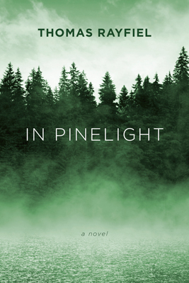
In Pinelight, by Thomas Rayfiel
covers for). His bio reads: “Charles Davis was born and educated, and has traveled and worked. He now lives and writes.”
Taking his lead, here goes: Lon Kirschner was born and educated, and has traveled (a bit) and works (and works). He now lives (thankfully) and designs.”
Hmm… I suppose you want more.
I was born in Queens, NY. A short walk to the 1964 World’s Fair grounds. The Unisphere is without a doubt my favorite piece of NY architecture. Growing up I loved to draw and knew that art was something I wanted to do. This was in spite of a crabby elementary art teacher telling me that even though I was good in art didn’t mean I could make a living at it. So much for early education!
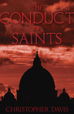
The Conduct of Saints, by Christopher Davis
I applied to several art colleges with my dream choice being The Cooper Union. A wonderful school with a long history of producing extraordinary designers and illustrators (what was I thinking?). Upon acceptance, each student was presented with a 100% tuition-free scholarship (what was I thinking?), a legacy that has existed since 1859 but is now sadly changing due to a difficult economic climate.
To my utter surprise I was accepted! After graduation I started as a lowly studio assistant and worked my way up to a slightly higher level of lowly studio assistant at a small boutique studio in New York City. After 3 years I felt it was time to strike out on my own. I gave up a steady paycheck and began freelancing. After several years I joined with my old employer and we ran the studio together. Over the years, he played less of a roll until he retired.
I met my wife Nancy Potter, who was working at the studio when I returned. Together we have maintained the business as partners and have adapted to the vast technological changes in the industry.
When and how did you get into graphic design? Was it something you just always knew you wanted to do? Does artistry run in the family, and if so, how far back does it go (I love histories!)?
When I first got into the business, I wanted to be an Illustrator. I found typography a bit overwhelming and thought that it would be
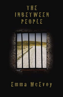
The Inbetween People, by Emma McEvoy
nice if all I had to do was draw pictures.
Reality set in, I needed a steady paycheck to cover my bad habit, playing drums in a rock and roll band. This required paying for rehearsal studios and gas to get to and from rehearsals and gigs. We were getting paid but you can’t pay bills on “all the beer you can drink.” When it looked like the big record deal wasn’t happening it was time to move on and start building my career in art.
My day job was at a studio that produced graphics for a very broad group of clients, including assignments for movie campaigns, corporate identity, logos, packaging and publishing. I had learned a great deal and my typography phobia was alleviated. I was ready to put down my drumsticks and concentrate on graphics.
You asked about artistry in my family. My mother’s sister is a very talented person. She was a singer and also paints, draws and works in various media. If there was a connection to anyone in the family as far as “art” is concerned I would say that is it, but it all depends on what you consider art. My grandmother and mother were fantastic cooks. They could open a refrigerator (I would see an egg and some capers) they would see the makings of a five-star meal. When I think back on that there was definitely an element of art involved. Art can come from anywhere.
Excellent point, Lon! “Art” is not just about graphics and typography…it’s also about eggs and capers! What is your earliest memory of the first manifestation of your talent?
Drawing pictures with my friend in first or second grade. Cowboys and Indians and army battles. Other kids played them, we drew them.
Love that last sentence! What medium do you prefer to work in?
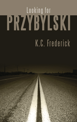
Looking for Przybylski, by K. C. Frederick
When I started in the business, it was all paint, pencils, rubber cement and razor blades. I was big on airbrushing but not so big on wearing my protective mask. Refer back to my answer for the bio question “He now lives (thankfully),” I must have inhaled gallons of dyes, acrylics and whatever else I could manage to spray. I was young and didn’t think about it.
Now it is all computer. It’s great to be able to set my own type, composite photos, produce comps that look printed and send files all over the world. The bad part is that many people (dare I say clients) think changes are simple and can be made at a moment’s notice. This gets into the whole concept-versus-production question. Don’t get me started. I see in the later questions that I will get my chance to state my case. If I sound to whinny, feel free to edit. No one will know (except me).
When and how did you get into book covers?
When I started freelancing, a friend of mine from college was working in the art department at Simon and Schuster. She told me I should come up and meet the art directors that gave out the assignments. I looked through their catalog and picked a few titles that I thought had less than inspired covers and redesigned them. I went up with my new book cover portfolio and landed some assignments. Most of these were in the “How To” genre, but I was happy to get the work. Another friend was working at Viking/Penguin. She invited me up to meet the creative director. I brought some of my airbrush paintings with me. He liked the work and handed me a rather long manuscript for a new book by an unknown author. The book was The Broom of the System, the first novel by David Foster Wallace. I did the cover illustration, the type was handled by their in-house art director. The cover was produced simultaneously as a dust jacket for hardcover as well as a paperback. I have the paperback, the hardcover was a limited run of 2,000. You can find them on ebay selling for fairly high prices.
How cool! You have pedigree! Could you describe your process for creating a cover?

An Unattended Death, by Victoria Jenkins
My design process for a book cover is fairly simple. I read the entire manuscript, if it is available. I then think about it for a while and then I start working. Many times where I started is not where I wind up. There have been happy accidents that take me in a whole new direction. The basic concept may be the same as when I started but the visual is totally different than what I originally had in mind. The truth is, most often than not I get an idea somewhere along the way, as I am reading. If it comes early I keep reading because there is always the chance that the idea won’t work out. People have commented to me that I really don’t need to read the entire book, a brief will do. Sometimes that is true, but I find more often than not ideas that come from a full manuscript would never have materialized if I had just read a few descriptive paragraphs. Books are like people, you need to go the distance before you really know them.
My goal is not to illustrate a particular scene in the book, but to convey a sense of what the book is about.
I’m quite impressed. So much of today is hurry up, do it yesterday, speed x 3! It’s nice to see you put in the in-depth interest, analysis, and effort. I’ve heard of so many dissatisfied authors, when it comes to their covers….
Okay, Kirschner Caroff is a full service graphic design and consulting company. You’re not “just” about book covers. You do all kinds of work: packaging, “corporate identity” work, movie posters, logos—can you explain a little about them, and if the processes for any of them is any different between them?
As a small studio we tend to “specialize” in all types of work. I have learned over the years that basically all design projects share
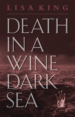
Death in a Wine Dark Sea, by Lisa King
something in common. If they are going to be successful, they need to be built on a concept. Of course execution is important, but if the concept is lousy, the best execution won’t make it a good design. In our digital world where everything and anything is possible I feel that this crucial concept is sometimes forgotten. My philosophy is keep it simple, keep it focused. Communicate in the least complicated way you can. We are in the business of communication. If your audience doesn’t get the point, you failed. It would be like writing a book in Russian for an English speaking audience. Not everything needs a special effect. In fact, in a world gone special-effects crazy, sometimes it is the simple things that make the greatest impact. I am all for effects and digital magic if they enhance the design. We all know you can put a monkey’s head on a man wearing a suit and make it look real. If that’s the right solution for the job go for it. If not, rethink it. I myself have put a few weird things in a suit, but I think I was justified.
Less is more! That was one of the reasons your cover for The Grievers really grabbed me! Such powerful subtlety! Is there a different process when working with a publisher than when you directly freelance with an author?
The process of working with an author is very different than working with a publisher. An author has a very personal relationship with their work. They have thought about it and worked on it for possibly years. They are so close to it that it is sometimes difficult for them to take a step back and look at it in a different light.
Many authors have ideas that they think are perfect, but in reality they might not be the best solution. I listen and see if there is something I can use, but if not, I go my own way and do what they have trusted me to do. It usually works out. In fact I can say it

Elysiana, by Chris Knopf
always has worked out. I have had a few rough ones along the way, but in the end, solutions were always found. There have been times when an author makes a suggestion that takes a concept from being a good solution to a great solution. I try to leave my ego at the door and listen. If a suggestion is made that may work, I am happy to try it.
Publishers are easier because there is less emotion involved. The cover I am working on for them is one in a long list of projects they need to get done. There isn’t the same personal interests. When you work for a small press, many times the author does get involved. I have met some very extraordinary and wonderful people over the years, I actually consider it a benefit of the job.
Great point, the contrast between authors and publishers. How did you get to work for Permanent Press (or any other publisher)? Can you give us a list of some of the other publishers you’ve worked with?
I sent out a printed mailer to about two hundred publishers that looked interesting. Mostly fiction. Martin Shepard (Permanent Press) called me in response to the promotion. We had a great conversation, he explained he was a small publisher and probably couldn’t afford it. I asked him what his cover budget was. After he answered I told him he was right, he couldn’t afford it. The problem was I got such a good feeling from him that I made him a proposal. I told him if he could send several books from his list I would do it. The old make-it-up-in-volume approach. He agreed and that was the beginning of a twenty-plus-year relationship. As the years went by, I got more books per list. I am now the de facto Permanent Press Creative Director/Art Department. I now do around sixteen books a year for them.
Over the years I have worked for Bantam/Doubleday/Dell, Simon and Schuster, Viking/Penguin, Paragon House, Northwestern University Press, Aldin DeGruyter and a host of smaller independent publishers.
What’s your typical work day like?
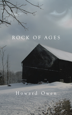
Rock of Ages, by Howard Owen
There is no such thing as a typical day. You can sit down to work and think you have your entire day planned and then the phone rings and everything goes out the window. It’s the nature of the beast. Feast or famine.
Rock and roll! Are there other forms of expression: a) you’re already doing, and b) you’re not, but would like to do?
My first love was illustration, but I seem to have gotten further and further away from it. A lot of the solutions tend to be more photo illustration. I would like to get back to doing artwork in a more traditional manner, or maybe a combination of digital and traditional. I still dream of doing an illustrated children’s book. It doesn’t even matter if it sells. Just completing that goal and having it done would be a very satisfying experience. I have several ideas and partially written manuscripts that no one has ever seen. It’s my secret. I love doing what I do, but having a book of my own would be very special.
Hmmm…ever consider indie publishing, or Creative Memories? I know a great Cover Guy…
What do you like to read, currently reading?
I like to read fiction. Things that take me away from the everyday. I love mysteries. I am currently reading one by P. D. James. I also enjoy the broad sweeping historical novels. I have Sarum, by Edward Rutherfurd waiting in the wings. I read London and really enjoyed it. I actually was reading it while we were on a UK family vacation last summer.
What do you feel is the [real] impact of cover art [on readers? Publishers? Buyers? Authors]?
Many years ago the creative director of Bantam books told me that if he could get a person to pick a book up in the store based on the

Standing at the Crossroads, by Charles Davis
cover then he had done his job. He couldn’t walk that person to the cash register, but by getting them to pick the book up the first part of the buying process had begun.
In the digital age the concept is the same, you still need to grab a reader’s attention. This is what authors and publishers expect and want. I feel covers are just as important now as they ever were, maybe even more so. Delivery methods come in all forms, but whether it is print, tablet, computer screen, or e-reader, a cover still needs to be impactful and compelling to the reader. If this weren’t true, all you would need for a cover would be a black-type title on a white background. A book cover is part of the whole package. It is the package. Sometimes the first impression a reader will have of a book will be based on the cover.
The internet has changed the way we buy books. When I am at an online site to buy a specific book, I very often see a cover that looks interesting and click on it to get more information. I have bought many books because the cover caught my attention. I may be a little more critical than others, but I think it works the same for everyone.
So, you can judge a book by its cover! How many projects do you have going on at any one time?
It varies. Right now I have about 13 or 14 books that need to be finished by the end of the summer in addition to some other corporate
work. The problem has always been that you think you will get to something and then another project with an earlier deadline comes in, you have to put something aside to get another project out the door. It’s all about time management. I am proud to say, the studio has never missed a deadline. We’ve missed some sleep, but never a deadline. This is a service business. You can do great work, but if you miss the deadline it doesn’t matter, you’ve produced the greatest design that no one will see.
Go on, Lon, get Zen, in any way you feel necessary about your business/efforts/work!
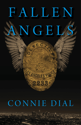
Fallen Angels, by Connie Dial
I love what I do. The wonderful part is that it is never quite the same. Each project is different and requires a unique solution. Some are not as exciting as others, but every project requires you to think differently. I don’t go to work every day and push the same piece of paper around. Some days are harder than others but that is probably the same for everyone no matter what they do. I produce something that is unique to me.
I still see things I designed years ago; it’s a very satisfying feeling. This past year we received an inquiry from The Canadian Museum of Civilization asking about using the cover art from The Magic Island as part of an exhibit on Voodoo. It is running now at the museum and will then travel throughout North America. That was a great feeling. I painted that cover many years ago using airbrush and traditional production methods. It won a Society of Illustrators award the year it was produced. After all the time that has gone by it’s exciting to see it have a new life and still remain a relevant design.
I am always happy to speak to people about possible projects. It’s part of what makes this exciting. You never know what the next call will bring.
Lon, if you were to have a gravestone, what would you have engraved upon it?
I hope I will have a gravestone or something to let the world know I was here. I think it would read: “There’s never enough time in the day.”
Thanks for your time, Lon! And I look forward to working with you on the cover for my next release, ERO!

Postcards from Pinsk, by Larry Duberstein. First cover Kirschner Caroff did for Permanent Press
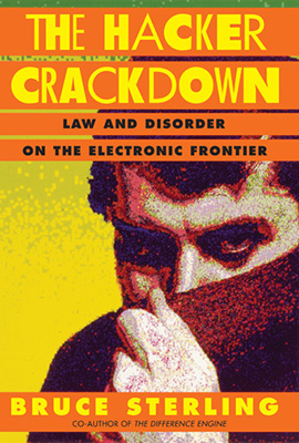
The Hacker Crackdown, by Bruce Sterling. First PC-generated Cover by Kirschner Caroff.
And…he had me at the cover:
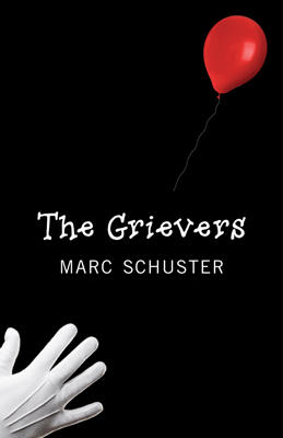
The Grievers, by Marc Schuster. My introduction to the world of Kirschner Caroff!
To contact Kirschner · Caroff Design Inc., for freelance:
Phone: 518/392-3823
E-mail: info@kirschnercaroff.com
Website: http://www.kirschnercaroff.com/section-pages/contact.html

")
")
")
")


")

Frank, I loved this interview! First, you don’t hear of many people named Lon anymore (my great grandfather was), so that caught my attention. 🙂
Second, being the daughter of an artist, I absolutely pay attention to a book’s cover art. Sometimes, I will look for different editions, just because I prefer one cover over another.
Third, this interview may just inspire me to contact Lon about creating a logo for me. I have always wanted a logo for my “blackcatpratt” domain/handle/internet identity (whatever), and I have something fairly particular in mind. While I’ve always imagined my mom illustrating it, she’s usually very caught up in her own projects, so the idea just gets mentioned, then forgotten.
And last but not least, this reminded me of something I saw on the web recently: 20 Embarrassingly Bad Book Covers for Classic Novels. Sheesh! http://flavorwire.com/378513/20-embarrassingly-bad-book-covers-for-classic-novels
Why, thanks, Mandy! It was so much fun to do! And, yeah, I thought of that, too, about his name. I also thought it interesting that we are both “east coasters,” though I’m somewhat removed and transplanted, but I mention that because when I was compiling this interview I could “see” it in his responses. It was cool. The rest of your comments are interesting, too, about waiting for a different cover edition, etc., and your own “brush” with art, pardon the pun! :-] I’m sure he’ll work up a great logo for ya!
Thanks for stopping by, 1-of-5-Barrelmate!
Frank: I’m so glad that you gave some time to artists. As a graphic designer myself, I often felt left out when the shiny brochures, eye-catching logos, and magazine covers that I had done never got noticed. Lon: I love your work and the simplicity of your covers. As a retired designer, I can identify with aspect you covered here. I’m working on a book cover for my middle grade novel, and your art gave me inspiration. Thanks for this interview.
Thank you, Martha, and so good to hear from you! Sounds like you’re doing well! I often think of our “old crew” from earlier PPWCs. :-] But, you’re right, it’s so strange that more air time is NOT given to these highly created, gifted people! And Lon even READS each manuscript! How many do that? I can’t think of *any* I’ve ever heard of doing that in all the years of PPWC presentations, from traditional Big 6/5 publishers/editors, etc. That also impressed me. So, hail to you, too, Martha, and *all* the other “Martha Lancasters” and “Karen Duvalls” (who did an *outstanding* effort on my The Uninvited cover, btw!) etc., out there! My hat goes off to all of you (Lon just got there “first”, in terms of this interview idea)!
Great interview! I’m going to pass this to Zach. Thanks Frank and Mr. Kirschner
Thanks, Karen!
Martha — glad you found the interview inspirational. Good luck with that cover!
Mandy — I can’t tell you how many times over the years I have been asked to repeat my name. I complained about it so much growing up, pleading to my mother to change it to “Bob” or “Joe”. Glad she stuck by her guns, also glad you found this interesting. I did see the 20 Bad Book Cover post. Unbelievable.
Great responses to interview questions Lon. Wonderful work Lon and Nancy!
Jerry (Smith)
Pingback: ERO Cover is on a NTK Basis…. | Runnin Off at the Mouth....
Pingback: The Music of ERO | Runnin Off at the Mouth....
Pingback: ERO—On Sale Now! | Runnin Off at the Mouth....
Pingback: Wailing Loon | Runnin Off at the Mouth....
Pingback: ERO—Trade Paperback Now Available! | Runnin Off at the Mouth....
Pingback: Going Indie—What I’ve Learned (So Far)—Part 6 | Runnin Off at the Mouth....
Pingback: Why Did I Go Indie? | Runnin Off at the Mouth....
Pingback: Going Indie—What I’ve Learned (So Far)—Part 8 | Runnin Off at the Mouth....
Pingback: Tattered Cover Book Store, MileHiCon, and Bookmarks! | Runnin Off at the Mouth....
Pingback: Bob Mayer—The Terminator | Runnin Off at the Mouth....
Pingback: Update on WIP: Out For Proofing | Runnin Off at the Mouth....
Pingback: Update on WIP: First Comments In! | Runnin Off at the Mouth....
Pingback: Update on WIP: Second Set of Comments In! | Runnin Off at the Mouth....
Pingback: Race to the Finish Line | Jaden Terrell
Thanks for the link, Jaden, and great cover! Lon does incredible work!
Pingback: Kirschner Cover Art: In Pinelight, by Thomas Rayfiel | Runnin Off at the Mouth....
Pingback: Clowns | Runnin Off at the Mouth....
Pingback: Kirschner Cover Art: “Clowns,” by F. P. Dorchak | Runnin Off at the Mouth....
Pingback: New Business Cards – Paranormal Fiction Writer | Runnin Off at the Mouth....
Pingback: Kirschner Cover Art: A Long Cold Fall, by Sam Reaves | Runnin Off at the Mouth....
Pingback: Kirschner Cover Art: Looking For Przybylski, by K.C. Frederick | Runnin Off at the Mouth….
Pingback: Kirschner Cover Art: Do The Dead Dream? | Runnin Off at the Mouth….
Pingback: I’m Surprisingly Okay | Runnin Off at the Mouth….
Pingback: A Philosophy of Stars | Runnin Off at the Mouth….
Pingback: A Philosophy Of Stars | Reality Check